High-Contrast Tile Design Ideas That Pop
High-contrast tile designs are bold, eye-catching, and full of personality. When done right, contrast adds depth, definition, and a custom feel to any space. When done wrong, it can feel busy or overwhelming.
This guide explores smart, stylish ways to use high-contrast tile designs in bathrooms, kitchens, floors, and feature areas — while keeping the space balanced and timeless.
What Is High-Contrast Tile Design?
High-contrast tile design uses strong visual differences between tiles to create impact. Contrast can come from:
- Light vs dark colors
- Matte vs glossy finishes
- Large vs small tile formats
- Smooth vs textured surfaces
The key is intentional contrast, not randomness.
1. Classic Black and White — With a Modern Twist
Black-and-white tile is timeless, but modern layouts make it feel fresh.
Ideas that work well:
- White wall tile with black grout
- Black floor tile paired with white walls
- Checkerboard floors in entryways or bathrooms
To keep it modern:
- Use large-format tiles
- Keep grout lines clean and consistent
- Pair with minimal fixtures
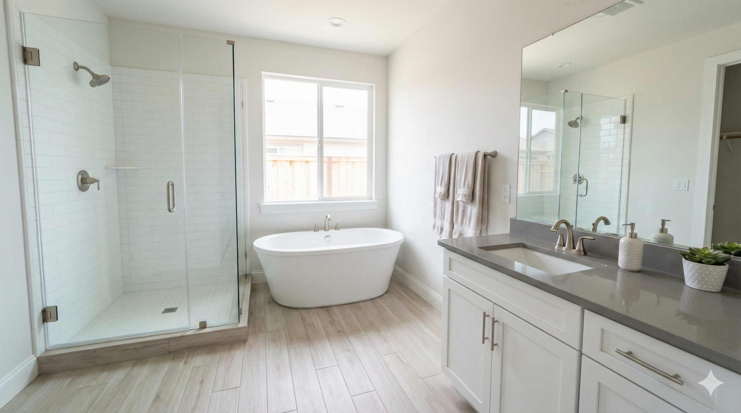
This style works especially well in bathrooms and mudrooms.
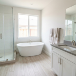
2. Dark Floors + Light Walls for Visual Balance
One of the easiest high-contrast designs is a dark tile floor with light wall tile.
Why it works:
- Grounds the space visually
- Makes walls feel taller
- Adds depth without clutter
Popular combinations:
- Charcoal floor + white wall tile
- Deep gray floor + light beige walls
- Dark slate floor + soft neutral walls
This approach is ideal for bathrooms, kitchens, and open living spaces.
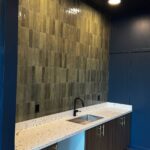
3. Statement Backsplashes That Stand Out
High-contrast backsplashes are a great way to add personality without overwhelming the room.
Design ideas:
- Dark tile backsplash with light cabinets
- Patterned tile behind the stove only
- Glossy tile paired with matte countertops
Because backsplashes are smaller areas, you can be bolder with contrast while keeping the rest of the kitchen calm.
4. Bold Grout as a Design Feature
Grout doesn’t have to disappear — it can become part of the design.
High-contrast grout ideas:
- White tile + dark grout for definition
- Light grout on dark tile for graphic effect
- Gray grout to soften contrast without losing detail
This works especially well with:
- Subway tile
- Geometric tile
- Brick-style layouts
Just remember: high-contrast grout highlights layout precision, so professional installation matters.
5. Mixing Tile Sizes for Visual Interest
Contrast isn’t only about color — tile size contrast can be just as powerful.
Examples:
- Large-format floor tile + small mosaic accents
- Subway tile walls + oversized floor tiles
- Simple base tile + decorative inset strips
This approach adds dimension while keeping the color palette controlled.
6. Feature Walls That Create a Focal Point
Instead of covering an entire room in contrast, use it strategically.
Great places for contrast feature walls:
- Shower walls
- Fireplace surrounds
- Entryway accents
- Behind vanities
A bold tile feature wall allows the rest of the space to remain neutral and balanced.
7. Contrast Through Texture, Not Just Color
Texture adds contrast in a more subtle, sophisticated way.
Ideas include:
- Smooth tile paired with textured stone
- Matte tile with glossy accents
- Flat surfaces combined with 3D tile
This works well in modern and contemporary interiors where color contrast is minimal but depth still matters.
Common High-Contrast Design Mistakes to Avoid
- Using too many bold tiles in one space
- Mixing multiple high-contrast patterns together
- Ignoring lighting (contrast needs good lighting)
- Choosing contrast without considering grout color
- Not planning the layout in advance
High contrast should feel intentional, not chaotic.
Lighting Makes or Breaks Contrast
Good lighting enhances contrast; poor lighting flattens it.
Tips:
- Use layered lighting (ambient + task + accent)
- Avoid harsh spotlights on glossy tile
- Highlight textured tile with directional lighting
Lighting helps define edges, patterns, and depth.
Final Thoughts
High-contrast tile designs are powerful tools when used thoughtfully. They can make a space feel modern, custom, and visually dynamic — without needing expensive materials.
The best high-contrast designs balance bold choices with restraint:
✔ One strong contrast element
✔ Clean layout
✔ Thoughtful lighting
✔ Professional installation
When done right, contrast doesn’t just pop — it elevates the entire space.

Hi, this is a comment.
To get started with moderating, editing, and deleting comments, please visit the Comments screen in the dashboard.
Commenter avatars come from Gravatar.